Design Process
I started by coming up with the brief for the project - an ambient vocal sample library that had the following features:
- Vowel/tone sounds
- Phrase builder
- Pad/ambience sounds
- Particle system
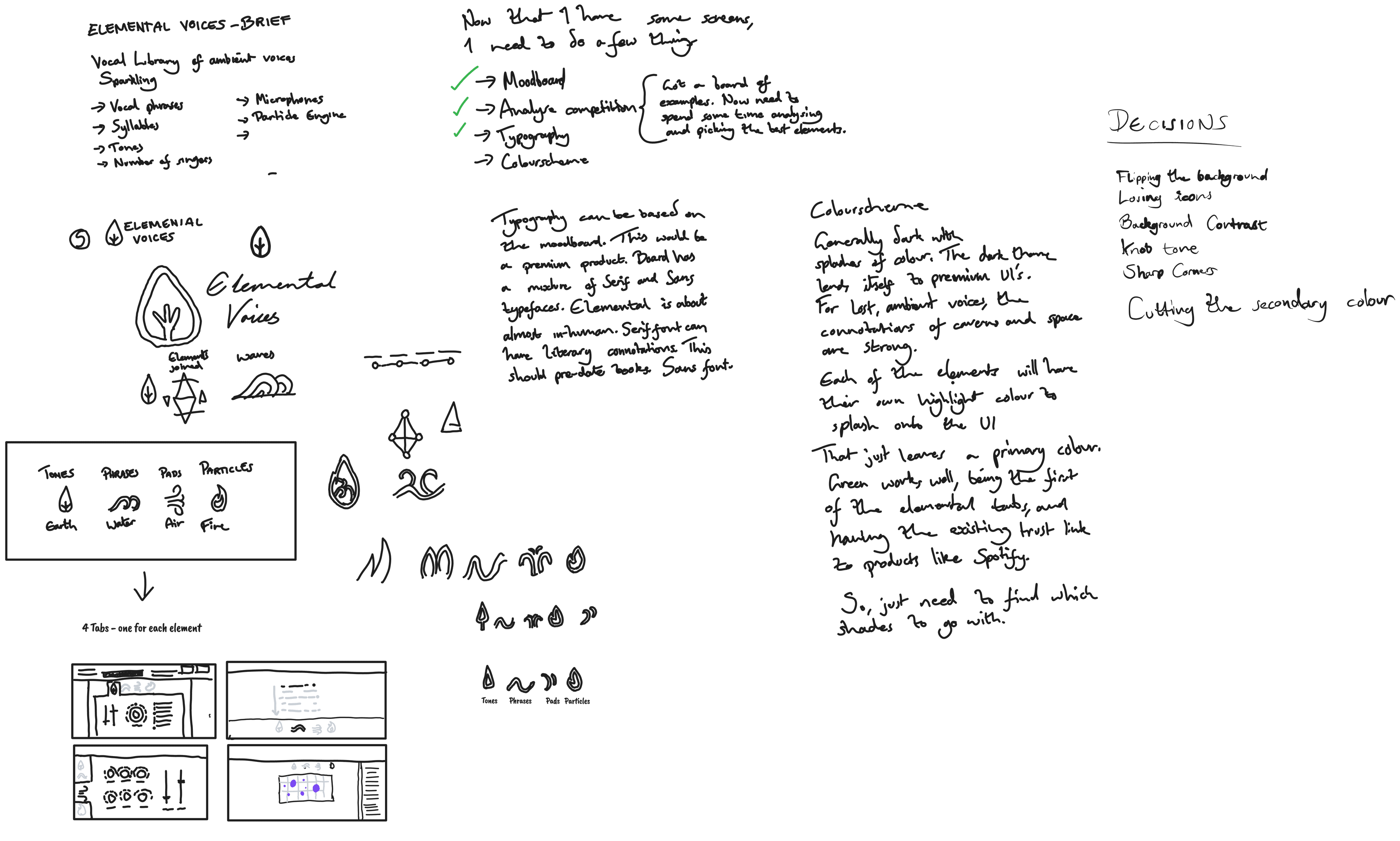
I began by making some notes about the theme for the library, along with some initial rough sketches of what the UI might look like.

Research
Once I had solidified the concept, I began analysing existing vocal libraries. I also put together a couple of idea boards to gauge tone for the UI, from which I could start building the style guide.

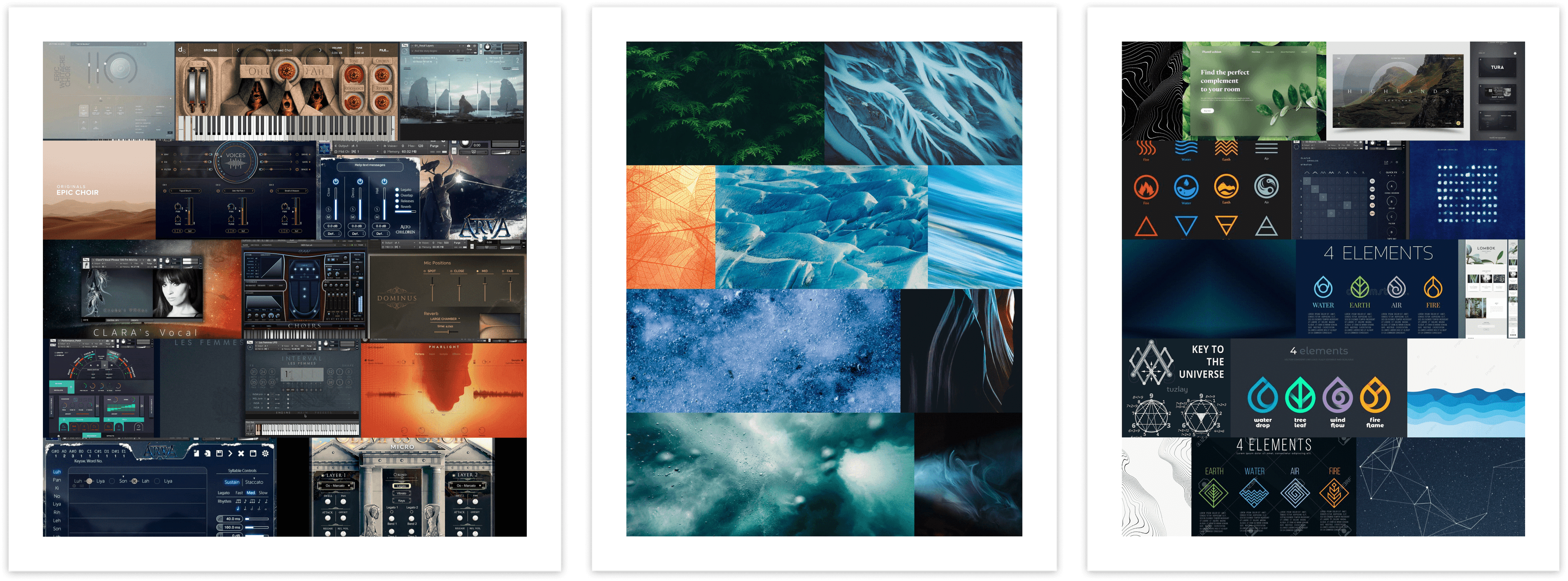
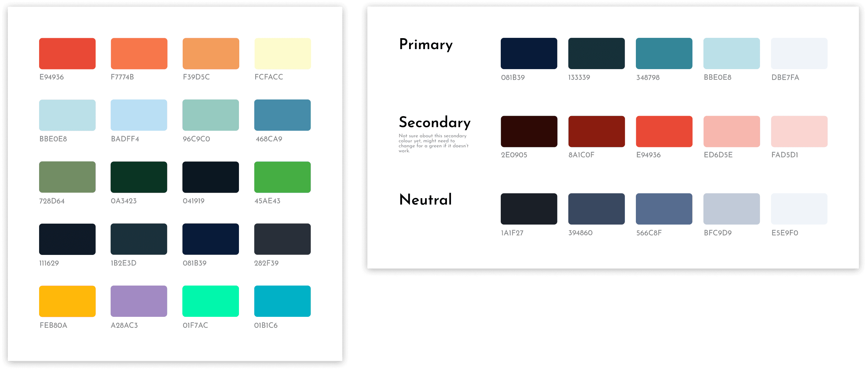
Colour Palette
Taking samples from the boards that were collated, I drew a range of initial colours for consideration. The dominant options were blues and oranges. From there, I chose an acquatic blue - feeding back into the original theme of the library, and generated a palette from it. I did the same with one of the sunset orange's for the secondary colour, before reducing the light value from the blue palette to generate a neutral set of colours.

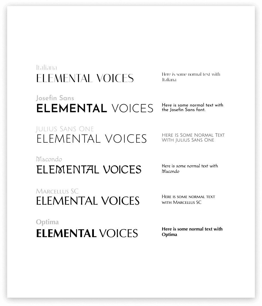
Typography
I gathered a selection of fonts with which to experiment. From the beginning, I decided not to go with a serif font, as it has too much of a literary connotation for something that is designed to be almost spiritualistic. Some of the more stylistic options provided an almost Norse-feel. Marcellus and Julius Sans had no lower case variant, and no weighting options. Italiana had too much of a 'fashion brand' feel to it. Josefin Sans had a balance of style and pureness that was desired.

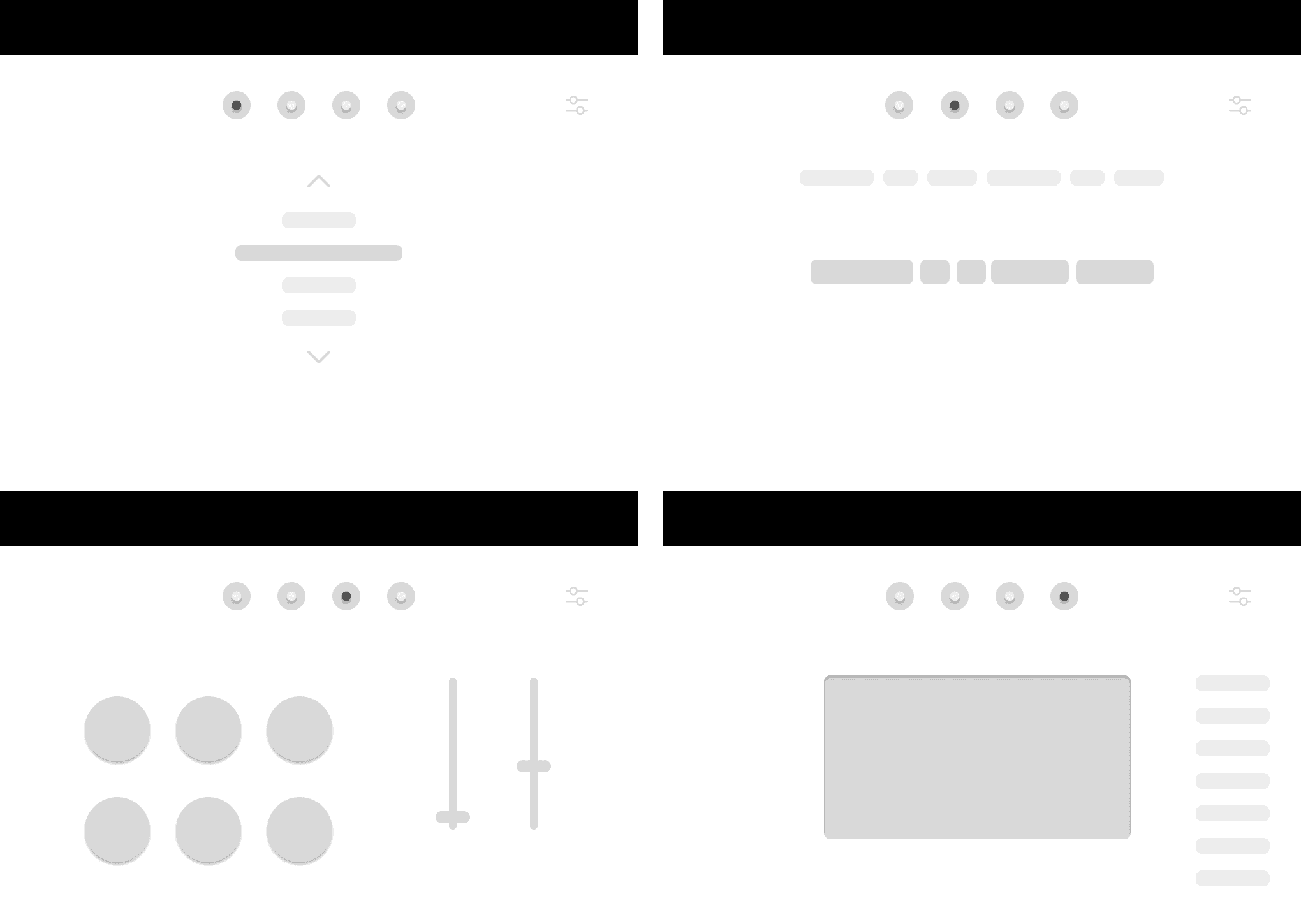
Wireframes
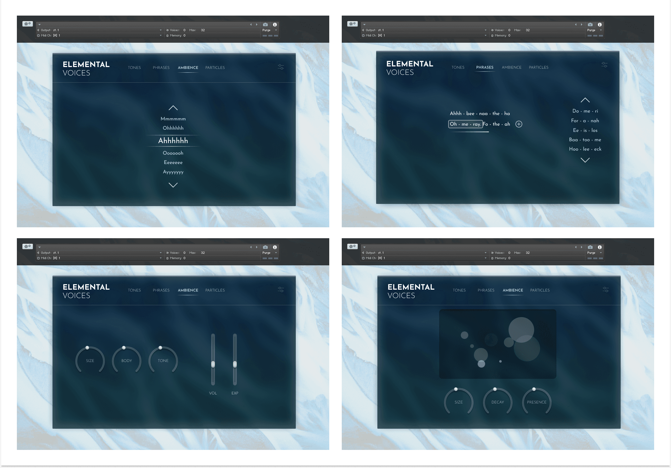
Based on the initial sketches, I created some wireframes - one for each of the main features of the interface (tones, phrases, ambience and particles).

Mockups

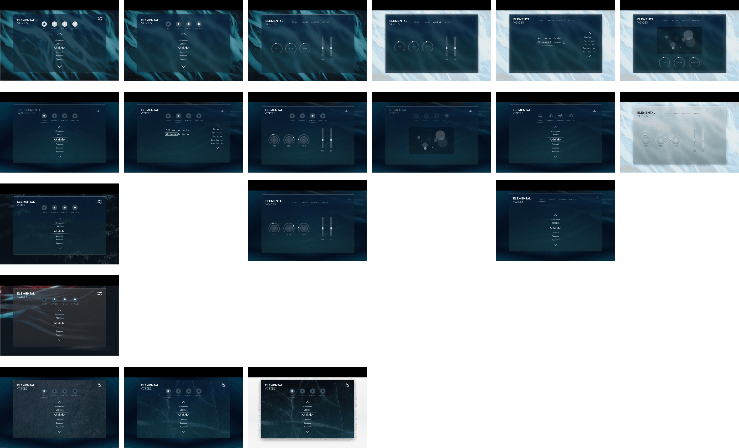
I then started creating higher fidelity mockups, filling in the panel content. This lead through a few unexpected decisions.
Dark Theme
I was initially sold on the dark theme, but after experimentation, the high contrast of the light background with a darker blue foreground panel was a much stronger look, drawing focus more clearly onto the panel itself, whilst still providing some visual interest in the background.
Frosted Glass
To handle the panel being above an image, I used a deep frosted glass effect, so as to blur much of the background of the panel, making it easier on the eyes to distinguish the UI controls, than when they are fighting for contrast with the detail of the background.
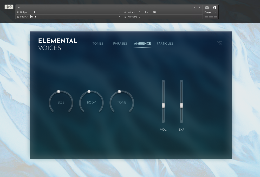
Knobs

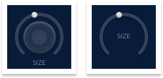
Starting with more visually interesting knobs, the design was becoming a little too cluttered, and given the inside of the initial knob design wasn't providing any function other than visual interest, I decided to reduce down to just the outer strip, moving the text into the middle - making them a little more cohesive, and fixing what became an unbalanced design with the labels still at the bottom.
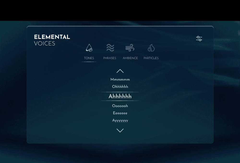
Losing the icons
Initially, I planned on using 'elemental' icons on the UI as the identifiers for each of the main tabs. The designs of the icons were very rough, but immediately I felt like they weren't necessary. The goal of an icon is to act as a more universal identifier for something, making the meaning either clearer when there is not enough space for the text, or when there might be a language barrier. These icons do not universally represent tones/phrases/ambience/particles, and therefore were only in for aesthetic benefit. So I decided to scrap them and go with just the text.

Final Design
Moving the tabs up, I compiled the branding, tabs and mixer option into a header, with a separator to more clearly distinguish the difference between the navigation and the panel content.