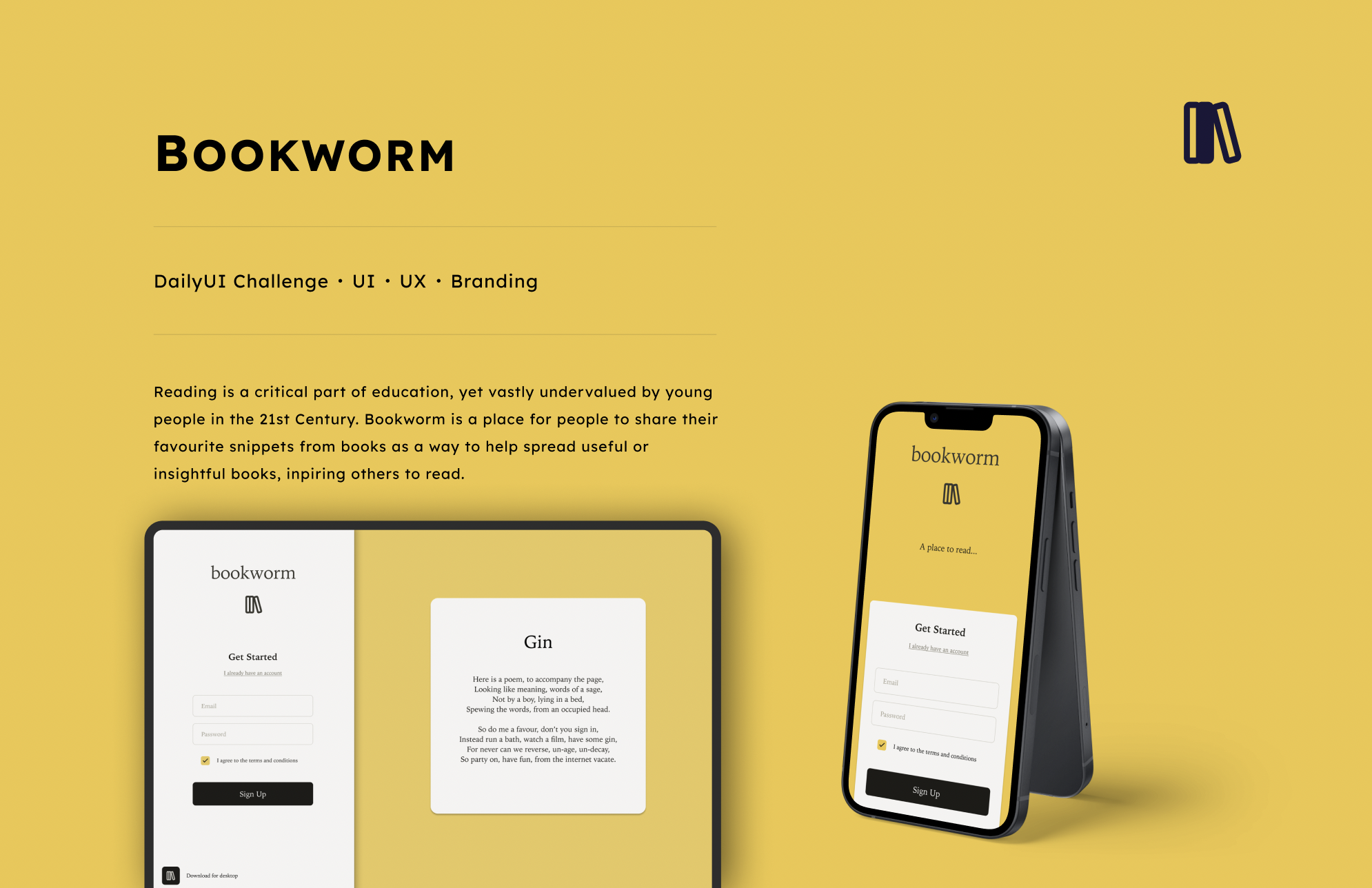
Intro
The WKAR (What Kids Are Reading) survey[1] found that from 2016 to 2020 has seen a 10% decrease in enjoyment towards reading from children. Bookworm is designed to provide a place for young people to leave snippets and comment on passages of interest from the books they are reading, serving to engage them both in their own reading, and as a bridge to other literature.
Branding
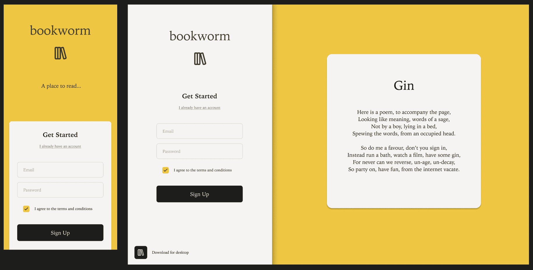
The immediate direction when it came to branding was to pick a strong primary colour. This is a platform entirely designed to engage and spark ideas - and as such, picking an engaging, playful, vibrant colour was important. Yellow has connotations with light, ideas, brightness and creativity - all aspects importatnt to Bookworm.


When it came to typography, choosing a serif font is important. It helps to establish a consistency between the platform itself, and the thing it’s here to celebrate: books. For this project, I opted for Iowan Old Style - which has just enough of a hint of playfulness.


Final Screens
The final screens were created using the Figma frame templates for iPhone and macbook pro.